About
Pre-2018, Archived - The current version of this page is available here.
The Story Behind The Site
Version 1.0 - 2013
Back in the summer between 4th and 5th grade, I was bored. As in, extremely bored. As in, I was ready to spend a few hours building a website with this program, "Dreamweaver", that I found on the internet, bored. So, doing what any other supposedly "tech-savvy" bored, 4th Grader would do: I made a website. You can find that site here. It was terrible.
That being said, I left it alone for a few years until I took Programming For Video Games at Duke TIP in the summer of 2013. There, programming using HTML 5 and Javascript, I remembered my old website and decided: Why Not? Let's rebuild it completely from scratch.
Of course, the problem with building from scratch is that I'm no graphic designer, and I don't make things look very pretty. Not that the old site looked nice in any way, but at least it didn't look like some teenager threw it together in his spare time...
Version 2.0 - 2016
What you just read was what originally appeared on this page in 2013, back when this site still looked a little something like this:
I'm sitting here three years later, and a lot has changed. Most of it has been documented in the blog, but some has just slipped by. Either way, my site has, surprisingly, grown.
Very early on, it became apparent to me that the design I had was not something to be proud of. The colorful abstract image background made it easy to mask that I had no visual design experience and was coding blind. For a first website attempt, this was acceptable, but as the permanent background to my personal site - what should be the flagship of my design experience - that was horrifyingly bad.
So I tried to change it. My first attempt came in early 2014, where, having learned CSS a little bit better, I tried to redesign the site with a dark theme. You can see it in the picture below. It was... a disaster. Don't get me wrong - there
were design ideas that I liked and even kept to this day, but the overall aesthetic was just unbearably bad. I liked the dark blue background, but the gradient kills me. The sectioned black backings were a cool concept, kind of like
Google's cards, but the execution was so incredibly poorly thought out - the entire page is almost all one big section and only the footer is on its own. Not to mention the spacing and the text shadows and the font and etc. I don't know. It just wasn't
doing it for me.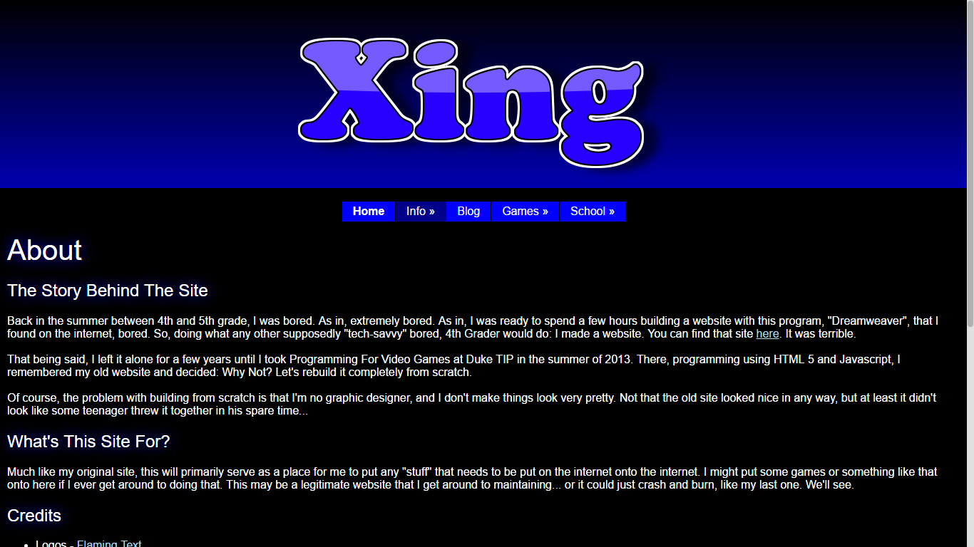
Attempt number two came in the summer of 2015. I was in Dallas for debate nationals and I had gotten very sick, so I was trapped in my hotel room with nothing but a laptop. What a perfect time to try to redesign my website, I thought. Then YouTube happened and... yeah, that never got beyond me loading up Google's Polymer library. My idea was that I was going to create a website using pure material design, as Android Lollipop had come out not long before and I thought it was absolutely stunning. I did eventually create a website for a school project that uses material design, and while I like how it turned out, doing it made me realize that copying and pasting Google was cheap and that there was value in having your own design.
Junior year comes and goes, and it's now the summer of 2016. Faced with a lull in Governor's School - the state camp I was attending - I decided that something actually needed to be done. For the first time in three years, I sat myself down in front of a completely empty index.php file and told myself "you're building a website from scratch - deal with it."
You can probably see the inspiration I took from all my past failures. The content and navigation bar mostly remained unchanged from my original site. The dark color scheme and the flat design came from the 2014 redesign attempt. The color scheme is ripped straight from material design, which I messed with in 2015. And the animations on the navigation bar were just a subtle pop that I, in a moment of inspiration, decided would look really cool. I still think they do.
This obviously is nowhere near perfect or even "good" from the perspective of a professional, but I'm a programmer, not a designer. It just so happened that, over the course of many years, I've kind of picked up a design language of my own. One that, while not particularly impressive, isn't complete garbage either (at least I think it isn't). And I felt it was time that my flagship site was updated to reflect that. So here it is. Xing 2.0. I hope you enjoy.
What's This Site For?
Much like my original site, this will primarily serve as a place for me to put any "stuff" that needs to be put on the internet onto the internet. I might put some games or something like that onto here if I ever get around to doing that. This may be a legitimate website that I get around to maintaining... or it could just crash and burn, like my last one. We'll see.
Credits
- Logos - Flaming Text
- Web Hosting - 000 Web Host
- Domain Name - My Dot TK
- SSL and CDN Cache - CloudFlare
- And My Friend Brian, From Whom I Ripped Off A Bunch Of Code - Bliu1.tk
All of these are free services (Except Possibly My Friend Brian)! ☺
The current version of this page is available here.